This basically sums up my experience with the Touch Bar after using it for a day:
Overall, I think it is a huge usability nightmare.
Really, it’s pretty terrible. The screenshots make it look a lot better than it actually is. From a first take at the bar itself, it suffers from two really unfortunate limitations:
- No haptic feedback, there’s not even any auditory feedback that you’ve pressed or interacted with something.
- It’s blurry. It’s rendered right next to the super crisp and clean lines of the MacBook Pro, the keyboard key text, and the beautiful retina display – it really looks out of place.
This screenshot does not accurately represent the quality that is actually rendered.

It actually looks nice and crisp there. But no… I don’t have a good enough lighting or camera setup to take a picture that accurately represents what the Touch Bar looks like in real life, but the best comparison I can think of is the difference between the non-retina and the retina iPhone displays. And you always have them side-by-side to look at things. I can feel my eyes re-focusing on them the bar and the screen as I look up and down from it.
Not only that, I’ve not found an app yet where I’m like, “oh, yeah, that’s really convenient that you’ve rendered stuff down in the touch bar.” You can see the screenshot above with the tabs… maybe that’s cool to you, but it takes significantly more effort for me to find the correct tab and navigate to it using the touch bar than to simply click or cycle through the tabs in Safari.
If anything, having the touch bar really makes it so I want to actually just touch the MacBook Pro’s screen. This is especially true during the configuration of the bar.
Maybe I’ll grow to like it over the next week or so, but my initial reaction is: wow, this thing is pretty crappy.
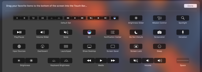
Thankfully there are options to hide the contextual app controls – they can be brought back up with a press of the “fn” key. I’ve customized my bar to leave it like this:

Maybe I’ll press “fn” every once in a while to see what apps have to offer, but most likely not. At least in this mode I don’t have to deal with the constant peripheral flickering I see as I navigate between apps.
The only thing I’ve liked about it the Touch Bar so far is the Touch ID integration. That’s been nice. However, if there was a proper 15” model with function keys, I’d return this model tomorrow morning.
Update Thursday, Nov 17th.
One thing I’ll add here: I think the biggest miss with the Touch Bar is that contextual UI in the bar is just not good. However, the power, that I think is really poorly executed, is the ability to control apps that are not the front-most apps.
You can do that today, but it appears that the only way to do it is to have the contextual UI available as well. Otherwise, you lose access that functionality. See below with the iTunes item within the Control strip and then that item expanded.


What I want, is to have the ability to have those attachments in the control strip attached to the Siri button, like in the default Touch Bar setup.
But alas, I see no option here to help with me that:
That functionality would make the Touch Bar significantly more useful. Contextual use within the currently opened app… still not feeling it.

[…] Update (2016-11-17): David Owens II: […]
LikeLike